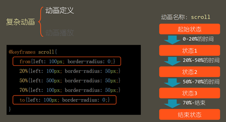
1、复杂动画
(1)涉及到的属性:
animation-name:动画名称;
animation-duration:单次动画总时长;
animation-timing-function:时间函数;
animation-delay:播放前延时的时长;
animation-iteration-count:播放次数(具体的数字),当设置infinite时是循环播放;
animation-direction:播放顺序,其中normal是正常播放,alternate是轮流反向播放,播放次数必须在2次以上。
(2)书写方式
@keyframes 名字(自己取一个名字){ ――>定义一个动画
}
 1 <!DOCTYPE html>
 2 <html lang="en">
 3
 4 <head>
 5     <meta charset="UTF-8">
 6     <meta name="viewport" content="width=device-width, initial-scale=1.0">
 7     <meta http-equiv="X-UA-Compatible" content="ie=edge">
 8     <title>复杂动画练习</title>
 9 </head>
10 <style>
11     .box {
12         width: 200px;
13         height: 200px;
14         background-color: blueviolet;
15         border: solid black;
16         position: relative;
17         top: 0;
18         /* 动画名称 */
19         animation-name: demo;
20         /* 动画时长 */
21         animation-duration: 5s;
22         /* 动画运行速度 */
23         animation-timing-function: cubic-bezier(0.075, 0.82, 0.165, 1);
24         /* 播放前延迟的时长 */
25         animation-delay: 3s;
26         /* 播放次数,这里写的时循环播放,可以写具体数字 */
27         animation-iteration-count: infinite;
28         /* 播放顺序,这里写的时轮流反向播放,可以写normal正常播放 */
29         animation-direction: alternate;
30     }
31
32     @keyframes demo {
33         from {
34             top: 0;
35             border-radius: 0;
36         }
37         20% {
38             top: 100px;
39             left: 100px;
40             border-radius: 30px;
41         }
42         50% {
43             top: 200px;
44             left: 100px;
45             border-radius: 30px
46         }
47         to {
48             top: 400px;
49             left: 400px;
50             border-radius: 50%
51         }
52     }
53 </style>
54
55 <body>
56     <div class="box">
57         动画练习
58         <!-- <img src="img/2010011712541759.jpg" alt=""> -->
59     </div>
60 </body>
61
62 </html>
效果如下:

2、盒子变形
(1) 变形:通过变形可以改变盒子的视觉效果,变形不会改变盒子原本的位置和尺寸,因此不会对其他元素造成影响。
(2) 变形的类型
Translate(移动)
Scale(缩放,1以下是缩小,1以上是扩大)
Skew(倾斜,单位deg)
Rotate(旋转,默认是沿着Z轴旋转,单位deg)
(3) 定义原点
Transform-origin:设置盒子的中心点。
(4) 其他属性
背面可见性:backface-visibility
visible:默认值,背面可见
hidden:背面不可见
 1 <!DOCTYPE html>
 2 <html lang="en">
 3
 4 <head>
 5     <meta charset="UTF-8">
 6     <meta name="viewport" content="width=device-width, initial-scale=1.0">
 7     <meta http-equiv="X-UA-Compatible" content="ie=edge">
 8     <title>盒子变形</title>
 9 </head>
10 <style>
11     .box {
12         width: 260px;
13         height: 260px;
14         position: relative;
15     }
16
17     .zheng,
18     .fan {
19         width: 260px;
20         height: 260px;
21         font-size: 26px;
22         border: solid black;
23         color: white;
24         text-align: center;
25         line-height: 260px;
26         position: absolute;
27         top: 0;
28         left: 0;
29         transition: all 1s;
30         backface-visibility: hidden;
31     }
32
33     .zheng {
34         background-color: blueviolet;
35         z-index: 2;
36     }
37
38     .fan {
39         background-color: green;
40         transform: rotateY(-180deg) rotateZ(-180deg);
41     }
42
43     .box:hover .zheng {
44         transform: rotateY(180deg) rotateZ(180deg);
45     }
46
47     .box:hover .fan {
48         transform: rotateY(0deg) rotateZ(0deg);
49     }
50 </style>
51
52 <body>
53     <div class="box">
54         <div class="zheng"&g