如需转载,请注明出处:Flutter学习笔记(20)--FloatingActionButton、PopupMenuButton、SimpleDialog、AlertDialog、SnackBar
-
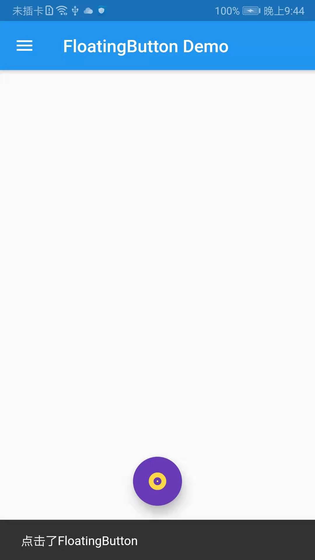
FloatingActionButton
FloatingActionButton对应一个圆形图标按钮,悬停在内容之上,以展示对应程序中的主要动作,所以非常醒目,类似于iOS系统里的小白点按钮。
FloatingActionButton组件属性及描述如下:
- child:child一般为icon,不推荐使用文字
- tooltip:按钮提示文字
- foregroundColor:前景色
- backgroundColor:背景色
- elevation:未点击时阴影值,默认6.0
- hignlightElevation:点击时阴影值
- onPressed:点击事件回调
- shape:定义按钮的shape,设置shape时,默认的elevation将会失效,默认为CircleBorder
import 'package:flutter/material.dart';
import 'package:fluttertoast/fluttertoast.dart';

void main() => runApp(DemoApp());

class DemoApp extends StatelessWidget{
  @override
  Widget build(BuildContext context) {
    // TODO: implement build
    return new MaterialApp(
      title: 'FloatingButton Demo',
      debugShowCheckedModeBanner: false,
      home: new Scaffold(
        appBar: AppBar(
          title: new Text('FloatingButton Demo'),
        ),
        drawer: Drawer(
          child: ListView(
            children: <Widget>[
              UserAccountsDrawerHeader(
                  accountName: new Text('FloatingButton Demo'),
                  accountEmail: new Text('www.baidu.com'),
                  currentAccountPicture: new CircleAvatar(
                    backgroundImage: AssetImage('images/user.jpeg'),
                  ),
              ),
              ListTile(
                title: new Text('我是主标题'),
                leading: Icon(Icons.add_circle_outline),
                subtitle: new Text('我是副标题'),
              ),
              ListTile(
                title: new Text('我是主标题'),
                leading: Icon(Icons.add_circle_outline),
                subtitle: new Text('我是副标题'),
              ),
              ListTile(
                title: new Text('我是主标题'),
                leading: Icon(Icons.add_circle_outline),
                subtitle: new Text('我是副标题'),
              ),
              ListTile(
                title: new Text('我是主标题'),
                leading: Icon(Icons.add_circle_outline),
                subtitle: new Text('我是副标题'),
              )
            ],
          ),
        ),
        floatingActionButton: new Builder(builder: (BuildContext context){
          return new FloatingActionButton(
              child: Icon(Icons.album),
              foregroundColor: Colors.amberAccent,
              backgroundColor: Colors.deepPurple,
              elevation: 10.0,
              highlightElevation: 20.0,
              mini: false,
              onPressed: (){
                Scaffold.of(context).showSnackBar(new SnackBar(content: new Text('点击了FloatingButton')));
              }
          );
        }),
        floatingActionButtonLocation: FloatingActionButtonLocation.centerFloat,
      ),
    );
  }

}
-
PopupMenuButton
构造方法:
  const PopupMenuButton({
    Key key,
    @required this.itemBuilder,//item子项,可以为任意类型
    this.initialValue,//初始值
    this.onSelected,//选中其中一项时回调
    this.onCanceled,//点击空白处,不选择时回调
    this.tooltip,//提示
    this.elevation = 8.0,//阴影大小
    this.padding = const EdgeInsets.all(8.0),//padding
    this.child,
    this.icon,
    this.offset = Offset.zero,
  }) : assert(itemBuilder != null),
        assert(offset != null),
        assert(!(child != null && icon != null)), // fails if passed both parameters
        super(key: key);
demo示例:
import 'package:flutter/material.dart';
import 'package:fluttertoast/fluttertoast.dart';

void main() => runApp(DemoApp());

class DemoApp extends StatelessWidget{
  @override
  Widget build(BuildContext context) {
    // TODO: implement build
    return new MaterialApp(
      title: 'FloatingButton Demo',
      debugShowCheckedModeBanner: false,
      home: new Scaffold(
        body: new Center(
          child: _showPopupMenuButton(),
        ),
        appBar: AppBar(
          title: new Text('FloatingButton Demo'),
        ),
        drawer: Drawer(
          child: ListView(
            c