Adroid布局
有人形象地比喻,Android开发中的布局就相当于一栋建筑的外观架构。布局用得好,这栋建筑的外观才美观高大上。
Android布局管理器
Android布局管理器本身是一个界面控件,所有的布局管理器都是ViewGroup类的子类,都是可以当做容器类来使用的。因此一个布局管理器中可以嵌套其他的布局管理器。
这是谷歌上找的一张布局管理器层级图

每一个ViewGroup都可以嵌套其他的ViewGroup和View(视图)。一个ViewGroup的大小是相对的,它即可以是其他ViewGroup的父容器,也可以是其他ViewGroup的子容器。在Android中,ViewGroup指代的是布局管理器,也就是下面要讲的布局样式,View指代的是布局管理器中的一个个控件。在Android中,控件可以在XML文件中定义,也可以程序员根据自己的需要去定义一个类。本文重点先不讨论视图中的控件,还是回归到布局。
Android六大基本布局管理器分别是:
线性布局(LinearLayout)、表格布局(TableLayout)、网格布局(GridLayout)、相对布局(RelativeLayout)、绝对布局(AbsoluteLayout)、层布局(FrameLayout)
其中,表格布局是线性布局的子类。网格布局是android 4.0后新增的布局。
(1)线性布局
线性布局会将容器内的所有控件一个挨着一个地排列。
属性:
1. 排列方向
android:orienation = “ horizontal/vertical”
水平排列和垂直排列,Android中默认为垂直排列vertical
注意:默认情况下水平和垂直方向的排列只占一行,如果用android:layout_width来设定控件的宽度,如果控件宽度太大,超出屏幕的显示范围,屏幕是不会显示超出的范围的。
2. 对齐方式
用于控制元素(例如文字)在该控件里的显示位置。
属性值:
可选的值有:top、bottom、left、right、center_vertical、fill_vertical、center_horizontal、fill_horizontal、center、fill、clip_vertical
也可以同时使用两个属性值,中间用 | 竖线隔开
例如:
android:gravity = “buttom|center_horizontal”
如果定义在控件中的底部,垂直居中
举一个简单例子,我用LinearLayout线性布局来实现常用的计算器
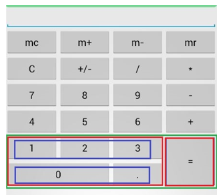
前面四行都很容易理解,用一个Linearout来包裹4个button控件,并且设定排列方向为水平方向。这里只列出其中一行的布局代码,其他三行的代码与第一行几乎相同。
<LinearLayout
        android:layout_width="match_parent"
        android:layout_height="wrap_content"
        android:orientation="horizontal" >
         <Button
             android:layout_width="match_parent"
             android:layout_height="wrap_content"
             android:text="mc" android:layout_weight="1">
            //layout_weight设定水平布局中控件的占比
         </Button>
         <Button
             android:layout_width="match_parent"
             android:layout_height="wrap_content"
             android:text="m+"
            android:layout_weight="1">
         </Button>
         <Button
             android:layout_width="match_parent"
             android:layout_height="wrap_content"
             android:text="m-"
            android:layout_weight="1">
         </Button>
         <Button
             android:layout_width="match_parent"
             android:layout_height="wrap_content"
             android:text="mr"
            android:layout_weight="1">
         </Button>
</LinearLayout>
最关键的是下面两行,即用绿色框框住的那一部分控件如何布局。这里我使用布局控制器内部嵌套布局控制器的方法。首先将绿色框内部的控件分成三个层级(我分别用不同颜色标注出来了)。第一个层级是绿色框,包含两个两列,即两个红色框。第二个层级是红色框,每个红色框看成一个整体的列,第一个列是左边的红色框,其内部包含两个行;第二个列是右边的红色框,即“=”号,包含一个垂直布局的列,占位两行。再对左边的红色框进行第三层级的拆分。可以拆分成两行,每一行占3个位。
于是就有下面的代码:
<!--绿色框-->
<LinearLayout android:orientation="horizontal"
        android:layout_width="match_parent"
        android:layout_height="wrap_content">

        <!--红色框-->
        <LinearLayout android:orientation="vertical"
                android:layout_weight="3"
                android:layout_width="wrap_content"
                android:layout_height="wrap_content">

             <!--蓝色框-->
             <LinearLayout android:orientation="horizontal"
                android:layout_width="match_parent"
                android:layout_height="wrap_content&quo