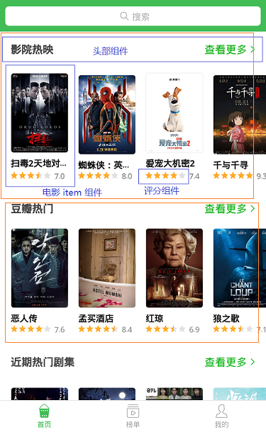
首页内容拆分
看效果图,首页由热门影院、豆瓣热门、热门影视等列表组成,每个列表又由头加横向滑动的 电影海报列表构成。
所以可以先把页面的电影海报、评分、列表头做成组件,然后在使用 ScrollView 将内容包裹即可构成首页。
开发头部组件
头部组件结构简单,唯一需要注意的就是点击查看更多的时候需要跳转页面,所有需要一个自定义事件,供页面使用。
在 src 目录创建 itemsHeader.js,内容如下:
import { Text, View, StyleSheet, TouchableWithoutFeedback } from 'react-native';
import PropTypes from 'prop-types';
import { px } from '../utils/device';
import Icon from 'react-native-vector-icons/AntDesign';

export default class ItemsHeader extends Component {
    constructor(props) {
        super(props);
    }
    static propTypes = {
        title: PropTypes.string,
        onPress: PropTypes.func
    }
    static defaultProps = {}
    render() {
        const { title, onPress } = this.props;
        return (
            <View style={styles.header}>
                <Text style={styles.title}>{title}</Text>
                <TouchableWithoutFeedback onPress={() => onPress && onPress()}>
                    <View style={styles.getMore}>
                        <Text style={styles.moreText}>查看更多</Text>
                        <Icon name='right' size={px(30)} color='#00b600'></Icon>
                    </View>
                </TouchableWithoutFeedback>
            </View>
        )
    }
}

const styles = StyleSheet.create({
    header: {
        height: px(90),
        width: px(750),
        paddingLeft: px(30),
        paddingRight: px(30),
        backgroundColor: '#ffffff',
        flexDirection: 'row',
        alignItems: 'center',
        justifyContent: 'space-between'
    },
    title: {
        fontSize: px(32),
        color: '#333',
        fontWeight: '600'
    },
    getMore: {
        flexDirection: 'row',
        alignItems: 'center',
    },
    moreText: {
        fontSize: px(28),
        marginLeft: px(30),
        color: '#00b600',
        marginRight: px(6)
    }
});
开发评分组件
评分组件需要考虑到星星大小、间距、颜色、数量,点击星星时改变星星的选中状态,并返回自定义事件 onPress 供调用者使用。
如果使用组件时调用了onPress,那么组件的值为可以改变,如果没有,那么组件应该为只读状态。
import React, { Component } from 'react';
import { Text, View, StyleSheet } from 'react-native';
import PropTypes from 'prop-types';
import { px } from '../utils/device';
import Icon from 'react-native-vector-icons/AntDesign';

export default class Rate extends Component {
    constructor(props) {
        super(props);
        this.state = {
            value: this.props.value
        }
    }
    componentWillReceiveProps(newProps) {
        const { value } = newProps;
        if (value !== this.state.value) {
            this.setState({
                value
            });
        }
    }
    static propTypes = {//如果使用组件时调用了onPress,那么组件默认为可以改变,如果没有,那么组件应该为只读
        value: PropTypes.number,
        size: PropTypes.number,
        margin: PropTypes.number,
        max: PropTypes.number,
        color: PropTypes.string,
        onPress: PropTypes.func
    }
    static defaultProps = {
        value: 0,
        size: 20,
        margin: 5,
        max: 5,
        color: '#00b600'
    }
    bindClick = (index) => {
        const { onPress } = this.props;
        if (!onPress) {
            return;
        }
        onPress(index + 1);
        this.setState({
            value: index + 1
        })
    }
    render() {
        const { size, margin, max, color, onPress } = this.props;
        const { value } = this.state;
        const defaultStars = [], activeStars = [];
        for (let i = 0; i < max; i++) {
            defaultStars.push(<Icon name='star' key={i} size={size} color='#ececec' onPress={() => this.bindClick(i)} style={{ marginRight: margin }}></Icon>)
        }
        for (let i = 0; i < value; i++) {
            activeStars.push(<Icon name='star' key={i} size={size} color={color} onPress={() => this.bindClick(i)} style={{ marginRight: margin }}></Icon>)
        }
        // 选中状态的星星的宽度
        const activeStarsWidth = (size + margin) * Math.floor(value) + size * (value - Math.floor(value));
        return (
            <View style={styles.rate}&g