1. 导入包
import pandas as pd
import matplotlib.pyplot as plt
import matplotlib.ticker as ticker
import matplotlib.gridspec as gridspec
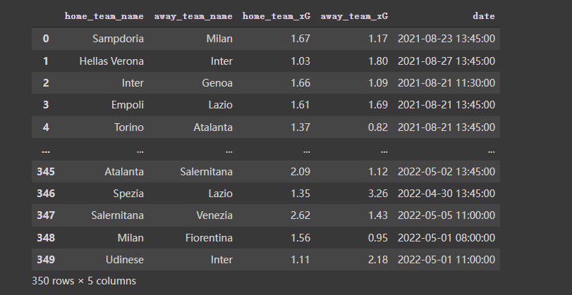
2. 获得数据
file_id = '1yM_F93NY4QkxjlKL3GzdcCQEnBiA2ltB'‘Python学习交流群:748989764 ’
url = f'https://drive.google.com/uc?id={file_id}'
df = pd.read_csv(url, index_col=0)
df
数据长得是这样的:
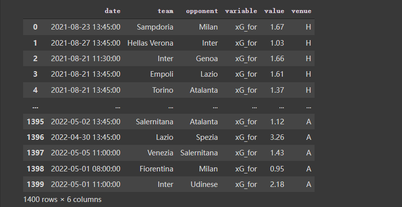
3. 对数据做一些预处理
按照需要,对数据再做一些预处理,代码及效果如下:
home_df = df.copy()
home_df = home_df.melt(id_vars = ["date", "home_team_name", "away_team_name"])
home_df["venue"] = "H"
home_df.rename(columns = {"home_team_name":"team", "away_team_name":"opponent"}, inplace = True)
home_df.replace({"variable":{"home_team_xG":"xG_for", "away_team_xG":"xG_ag"}}, inplace = True)
away_df = df.copy()
away_df = away_df.melt(id_vars = ["date", "away_team_name", "home_team_name"])
away_df["venue"] = "A"
away_df.rename(columns = {"away_team_name":"team", "home_team_name":"opponent"}, inplace = True)
away_df.replace({"variable":{"away_team_xG":"xG_for", "home_team_xG":"xG_ag"}}, inplace = True)
df = pd.concat([home_df, away_df]).reset_index(drop = True)
df
4. 画图
# ---- Filter the data

Y_for = df[(df["team"] == "Lazio") & (df["variable"] == "xG_for")]["value"].reset_index(drop = True)
Y_ag = df[(df["team"] == "Lazio") & (df["variable"] == "xG_ag")]["value"].reset_index(drop = True)
X_ = pd.Series(range(len(Y_for)))

# ---- Compute rolling average

Y_for = Y_for.rolling(window = 5, min_periods = 0).mean() # min_periods is for partial avg.
Y_ag = Y_ag.rolling(window = 5, min_periods = 0).mean()
fig, ax = plt.subplots(figsize = (7,3), dpi = 200)

ax.plot(X_, Y_for)
ax.plot(X_, Y_ag)
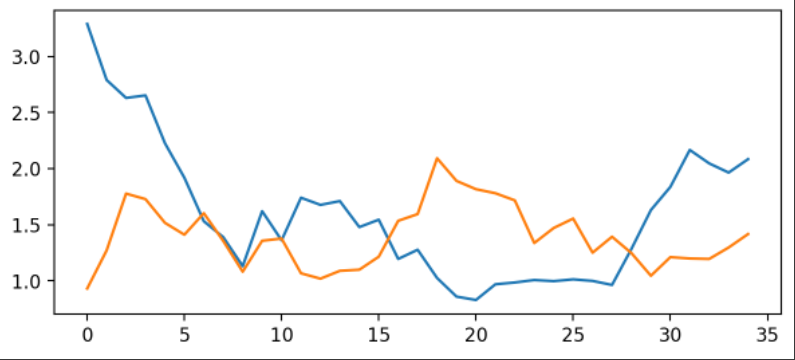
使用matplotlib倒是可以快速把图画好了,但是太丑了。接下来进行优化。
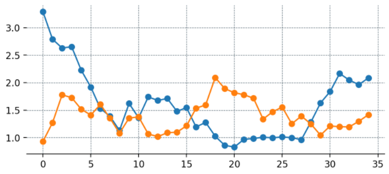
4.1 优化:添加点
这里为每一个数据添加点
fig, ax = plt.subplots(figsize = (7,3), dpi = 200)

# --- Remove spines and add gridlines

ax.spines["left"].set_visible(False)
ax.spines["top"].set_visible(False)
ax.spines["right"].set_visible(False)

ax.grid(ls = "--", lw = 0.5, color = "#4E616C")

# --- The data

ax.plot(X_, Y_for, marker = "o")
ax.plot(X_, Y_ag, marker = "o")
4.2 优化:设置刻度
fig, ax = plt.subplots(figsize = (7,3), dpi = 200)

# --- Remove spines and add gridlines

ax.spines["left"].set_visible(False)
ax.spines["top"].set_visible(False)
ax.spines["right"].set_visible(False)

ax.grid(ls = "--", lw = 0.25, color = "#4E616C")

# --- The data

ax.plot(X_, Y_for, marker = "o", mfc = "white", ms = 5)
ax.plot(X_, Y_ag, marker = "o", mfc = "white", ms = 5)

# --- Adjust tickers and spine to match the style of our grid

ax.xaxis.set_major_locator(ticker.MultipleLocator(2)) # ticker every 2 matchdays
xticks_ = ax.xaxis.s